
Hi SharePoint fellows !
Today, I am writing about the outcome of some research I made on how to display the content of my custom WebPart according to the layout column it is inserted in.
Responsive Web pages
In the last 10 years or so, the key when designing web pages is that they are responsive. It means, that, its layout is intuitive and user-friendly whatever the device used to display it. Desktop computers, smartphones, tablets and so on, they come with various display size, ratio, resolutions, etc... Anyway, the user experience should be optimal when visiting a web page from desktop or smartphone. With the arrival of SharePoint Modern user experience, this concept of one of the keys. It mainly relies on a UI Framework from Microsoft called Office UI Fabric, most of the current Microsoft web-based interfaces relies on this framework nowadays. You can learn more about it here. This framework comes with a lot of reusable UI components but also provide core features mainly based on CSS for the UI to be responsive and consistent in styling.
Office UI Fabric layout
In this post, I will focus on the layout handling in the Office UI Fabric core. It is quite similar to the Bootstrap Grid layout (for those who heard about it). It allows, just by using some specific CSS classes to have a consistent and responsive layout in your UI. The concept is simple, the width of the container (whatever it is) is split into 12 columns. By using some classes, you specify whether you want your element to be 12 columns wide or only 4 columns wide, for instance, ... The smart part here, is that these classes exist adapted for a variety of displays scales
| name | resolution |
|---|---|
| small | 320px - 479px |
| medium | 480px - 639px |
| large | 640px - 1023px |
| extra large | 1024px - 1365px |
| exta extra large | 1366px - 1919px |
| extra extra extra large | 1920px and up |
When you apply a class for a specific scale, you apply it for this specific one and all the larger scales. I won't dig more into the details since it is very well explained here.
SharePoint Modern Pages sections
If you have used the Modern Pages in SharePoint during the last couples of years, you probably noticed, the appearing of the section layouts. It allows to split your sections in columns according to some ratio (one column, two colums, three columns, one third, two thirds). Formerly, you only could stack your components in full-width sections. This column splitting is relying on the same principle as Office UI Fabric layout. For instance, if your section is split into 3 columns, each column will have the following CSS classes: CanvasSection CanvasSection-col CanvasSection-sm12 CanvasSection-xl4 You might have noticed that the section layout will only take place in displays wide enough corresponding to the XL breakpoint (1024px minimum), for smaller displays, it will render as a full width block.
Being responsive with Office UI Fabric
With Office UI Fabric, we can specify that our elements will display on two columns above a specific display size, and on a full width column below that step.
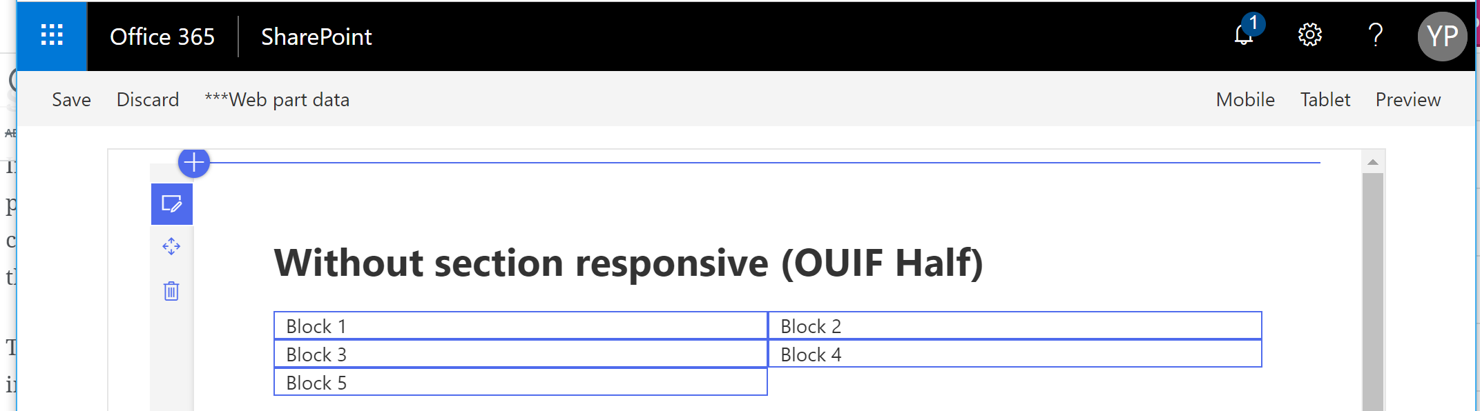
<div className="ms-Grid-row">
  <h1>Without section responsive (OUIF Half)</h1>
  <div className={`ms-Grid-col ms-sm12 ms-xl6 ${styles.outline}`}>
    Block 1
  </div>
  <div className={`ms-Grid-col ms-sm12 ms-xl6 ${styles.outline}`}>
    Block 2
  </div>
  <div className={`ms-Grid-col ms-sm12 ms-xl6 ${styles.outline}`}>
    Block 3
  </div>
  <div className={`ms-Grid-col ms-sm12 ms-xl6 ${styles.outline}`}>
    Block 4
  </div>
  <div className={`ms-Grid-col ms-sm12 ms-xl6 ${styles.outline}`}>
    Block 5
  </div>
</div>
The HTML extract above will result as
with my browser taking my whole display width, if I reduce the window size however, it will look like

Because I used the ms-sm12 to indicate it should take 12 columns on 12 from the SM (small) breakpoint and ms-xl6 to indicate it should take 6 columns on 12 starting from the XL breakpoint. That works very well with a full width section !
With a different section layout
Let's see now if we change the layout of the section
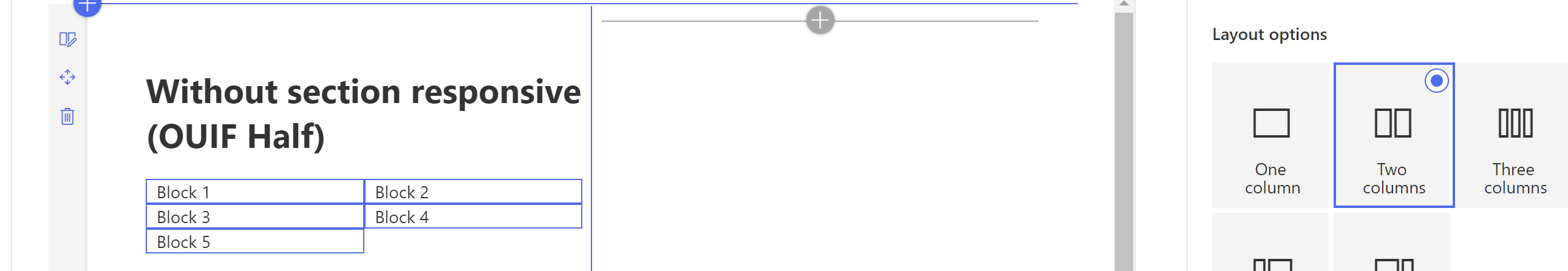
The content will still take the whole width of its container. That might become less readable, and obviously, not user-friendly...
A piece of CSS to act like Office UI Fabric layout with sections
I, then, came up with just a bunch of CSS lines that will allow to use the same principle as Office UI Fabric layout but according to the container section (or column more exactly). There is no rocket science here, just a principle of CSS applied about nested selectors
@import '~@microsoft/sp-office-ui-fabric-core/dist/sass/SPFabricCore.scss';

.CanvasSection.CanvasSection-col {
    &.CanvasSection-xl12 {
        .OneColumnSection-1 {
            @include ms-Grid-col;
            @include ms-xl1;
        }

        .OneColumnSection-2 {
            @include ms-Grid-col;
            @include ms-xl2;
        }

        .OneColumnSection-3 {
            @include ms-Grid-col;
            @include ms-xl3;
        }

        .OneColumnSection-4 {
            @include ms-Grid-col;
            @include ms-xl4;
        }

        .OneColumnSection-5 {
            @include ms-Grid-col;
            @include ms-xl5;
        }

        .OneColumnSection-6 {
            @include ms-Grid-col;
            @include ms-xl6;
        }

        .OneColumnSection-7 {
            @include ms-Grid-col;
            @include ms-xl7;
        }

        .OneColumnSection-8 {
            @include ms-Grid-col;
            @include ms-xl8;
        }

        .OneColumnSection-9 {
            @include ms-Grid-col;
            @include ms-xl9;
        }

        .OneColumnSection-10 {
            @include ms-Grid-col;
            @include ms-xl10;
        }

        .OneColumnSection-11 {
            @include ms-Grid-col;
            @include ms-xl11;
        }

        .OneColumnSection-12 {
            @include ms-Grid-col;
            @include ms-xl12;
        }
    }

    &.CanvasSection-xl6 {
        .TwoColumnsSection-1 {
            @include ms-Grid-col;
            @include ms-xl1;
        }

        .TwoColumnsSection-2 {
            @include ms-Grid-col;
            @include ms-xl2;
        }

        .TwoColumnsSection-3 {
            @include ms-Grid-col;
            @include ms-xl3;
        }

        .TwoColumnsSection-4 {
            @include ms-Grid-col;
            @include ms-xl4;
        }

        .TwoColumnsSection-5 {
            @include ms-Grid-col;
            @include ms-xl5;
        }

        .TwoColumnsSection-6 {
            @include ms-Grid-col;
            @include ms-xl6;
        }

        .TwoColumnsSection-7 {
            @include ms-Grid-col;
            @include ms-xl7;
        }

        .TwoColumnsSection-8 {
            @include ms-Grid-col;
            @include ms-xl8;
        }

        .TwoColumnsSection-9 {
            @include ms-Grid-col;
            @include ms-xl9;
        }

        .TwoColumnsSection-10 {
            @include ms-Grid-col;
            @include ms-xl10;
        }

        .TwoColumnsSection-11 {
            @include ms-Grid-col;
            @include ms-xl11;
        }

        .TwoColumnsSection-12 {
            @include ms-Grid-col;
            @include ms-xl12;
        }
    }

    &.CanvasSection-xl4 {
        .OneThird-1, .ThreeColumnsSection-1 {
            @include ms-Grid-col;
            @include ms-xl1;
        }

        .OneThird-2, .ThreeColumnsSection-2 {
            @include ms-Grid-col;
            @include ms-xl2;
        }

        .OneThird-3, .ThreeColumnsSection-3 {
            @include ms-Grid-col;
            @include ms-xl3;
        }

        .OneThird-4, .ThreeColumnsSection-4 {
            @include ms-Grid-col;
            @include ms-xl4;
        }

        .OneThird-5, .ThreeColumnsSection-5 {
            @include ms-Grid-col;
            @include ms-xl5;
        }

        .OneThird-6, .ThreeColumnsSection-6 {
            @include ms-Grid-col;
            @include ms-xl6;
        }

        .OneThird-7, .ThreeColumnsSection-7 {
            @include ms-Grid-col;
            @include ms-xl7;
        }

        .OneThird-8, .ThreeColumnsSection-8 {
            @include ms-Grid-col;
            @include ms-xl8;
        }

        .OneThird-9, .ThreeColumnsSection-9 {
            @include ms-Grid-col;
            @include ms-xl9;
        }

        .OneThird-10, .ThreeColumnsSection-10 {
            @include ms-Grid-col;
            @include ms-xl10;
        }

        .OneThird-11, .ThreeColumnsSection-11 {
            @include ms-Grid-col;
            @include ms-xl11;
        }

        .OneThird-12, .ThreeColumnsSection-12 {
            @include ms-Grid-col;
            @include ms-xl12;
        }
    }

    &.CanvasSection-xl8 {
        .TwoThirds-1 {
            @include ms-Grid-col;
            @include ms-xl1;
        }

        .TwoThirds-2 {
            @include ms-Grid-col;
            @include ms-xl2;
        }

        .TwoThirds-3 {
            @include ms-Grid-col;
            @include ms-xl3;
        }

        .TwoThirds-4 {
            @include ms-Grid-col;
            @include ms-xl4;
        }

        .TwoThirds-5 {
            @include ms-Grid-col;
            @include ms-xl5;
        }

        .TwoThirds-6 {
            @include ms-Grid-col;
            @include ms-xl6;
        }

        .TwoThirds-7 {
            @include ms-Grid-col;
            @include ms-xl7;
        }

        .TwoThirds-8 {
            @include ms-Grid-col;
            @include ms-xl8;
        }

        .TwoThirds-9 {
            @include ms-Grid-col;
            @include ms-xl9;
        }

        .TwoThirds-10 {
            @include ms-Grid-col;
            @include ms-xl10;
        }

        .TwoThirds-11 {
            @include ms-Grid-col;
            @include ms-xl11;
        }

        .TwoThirds-12 {
            @include ms-Grid-col;
            @include ms-xl12;
        }
    }
}
You can copy the SCSS above and copy it to a file named CanvasSection.scss for example.
Take care! It must not be in a .module.scss file because it will append unique hash to the CSS class names, and it is not intended here.
You can then apply one of the following classes to your elements to specify how that should render according to their container section layout:
- OneColumnSection-x
- TwoColumnsSection-x
- ThreeColumnsSection-x
- OneThird-x
- TwoThirds-x
The x should be replaced by a number between 1 and 12 indicating how many columns it should span on.
Let's see in practice
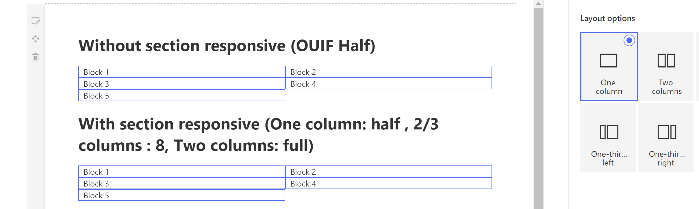
Let's append a new piece of HTML to our previous one
<div className="ms-Grid-row">
<h1>Without section responsive (OUIF Half)</h1>
<div className={`ms-Grid-col ms-sm12 ms-xl6 ${styles.outline}`}>
Block 1
</div>
<div className={`ms-Grid-col ms-sm12 ms-xl6 ${styles.outline}`}>
Block 2
</div>
<div className={`ms-Grid-col ms-sm12 ms-xl6 ${styles.outline}`}>
Block 3
</div>
<div className={`ms-Grid-col ms-sm12 ms-xl6 ${styles.outline}`}>
Block 4
</div>
<div className={`ms-Grid-col ms-sm12 ms-xl6 ${styles.outline}`}>
Block 5
</div>
</div>
<div className="ms-Grid-row">
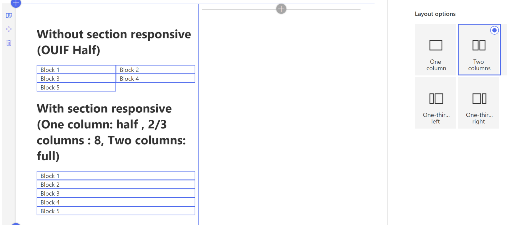
<h1>With section responsive (One column: half , 2/3 columns : 8, Two columns: full) </h1>
<div className={`ms-Grid-col ms-xl6 OneColumnSection-6 TwoThirds-8 TwoColumnsSection-12 ThreeColumnsSection-12 OneThird-12 ${styles.outline}`}>
Block 1
</div>
<div className={`ms-Grid-col ms-xl6 OneColumnSection-6 TwoThirds-8 TwoColumnsSection-12 ThreeColumnsSection-12 OneThird-12 ${styles.outline}`}>
Block 2
</div>
<div className={`ms-Grid-col ms-xl6 OneColumnSection-6 TwoThirds-8 TwoColumnsSection-12 ThreeColumnsSection-12 OneThird-12 ${styles.outline}`}>
Block 3
</div>
<div className={`ms-Grid-col ms-xl6 OneColumnSection-6 TwoThirds-8 TwoColumnsSection-12 ThreeColumnsSection-12 OneThird-12 ${styles.outline}`}>
Block 4
</div>
<div className={`ms-Grid-col ms-xl6 OneColumnSection-6 TwoThirds-8 TwoColumnsSection-12 ThreeColumnsSection-12 OneThird-12 ${styles.outline}`}>
Block 5
</div>
</div>
And see what it looks like with One column, the result is exactly the same
With 2 columns instead:

And VOILA !
Conclusion
This is a trick you can use and I came up with relying on some research I made. However, I could not find any official statement that these CSS classes used in section layout will remain untouched. This means this solution might be broken at some point. Will probably need some official guidance or officially fixed CSS classes from Microsoft for this trick to be a long term valid thing !
Hope you liked it and give your feedback !
Cheers,
Yannick