
Hi SharePoint guys,
Today, I am going to show and share how we can build a reusable and flexible wizard component we will be able to use in our SPFx solutions ! Actually, it is a component that can be used in any React application but I'll show it using a SPFx solution since all the boilerplate is already in there (moreover my intent was to use it in SPFx solution so... :D)
The purpose
As in many applications, we might need to guide our users through steps in order to fill in information in a consistent way, the solution I am going to demonstrate here is a way to have a generic component that will take care of the Wizard behavior instead of rewriting it each time we need something similar. In this blog post, I am going to share the whole code and demonstrate the logic and how to use it.
The implementation
The component is implemented in a reeeally simple way with only a few "navigation" buttons, and a Office UI Fabric Pivot component. And, IMHO, it looks quite good and integrates smoothly with Microsoft UI trends. So we need the following:
- A Pivot component that will render the pages (steps) of our wizard
- A "Previous" button if there is an available previous step
- A "Next" button if there is an available next step
- A "Cancel" button always visible
- A "Finish" button if we are at the last step of the wizard.
Enum flags
We need to provide a list of individual steps and identify them uniquely. In order to simplify the logic and try to make it as generic as it can be, I'll use a TypeScript enum flags, it is a concept I used a lot in C#, and when suitable, I use it in TypeScript as well, we declare an enum and set the numeric value of each enum member as a binary single bit mask value
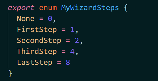
We could have written in the following form to emphasize the used binary bits
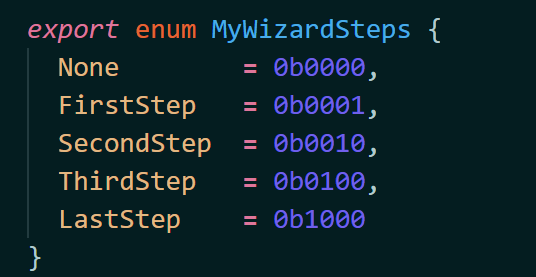
Notice the "None" value set to 0, that value will never be used, and a Wizard step cannot be identified by 0, because the bitwise operators (bit shifts) won't work with all 0s :)
Show me the code !
In order to have a component easy to reuse and have intellisense in VS Code, I chose to write an abstract component with a generic parameter that will hold the type our steps enum. You can take the code of this abstract component as is and put it somewhere in your solution, unless you need to improve it or adapt it, you would probably not need to change this code. However, feel free to take a look at the code to see how the bitwise operators are helping here :)
For instance, you can put the following code in a components/ folder under your SPFx src/ folder in a file Wizard.tsx
import * as React from "react";
import { ActionButton } from "office-ui-fabric-react/lib/Button";
import { Pivot, PivotItem, IPivotItemProps } from "office-ui-fabric-react/lib/Pivot";
import styles from "./Wizard.module.scss";

export interface IWizardStepProps<TStep extends number> extends IPivotItemProps {
    step: TStep;
    caption: string;
}

export class WizardStep<TStep extends number> extends React.Component<IWizardStepProps<TStep>, {}> {

}

export interface IWizardStepValidationResult {
    isValidStep: boolean;
    errorMessage?: string;
}

export interface IWizardProps<TStep extends number> {
    defaultCurrentStep?: TStep;
    onValidateStep?: (currentStep: TStep) => IWizardStepValidationResult | Promise<IWizardStepValidationResult>;
    onCompleted?: () => void;
    onCancel?: () => void;
    nextButtonLabel?: string;
    previousButtonLabel?: string;
    cancelButtonLabel?: string;
    finishButtonLabel?: string;
    validatingMessage?: string;
    mainCaption?: string;
}

export interface IWizardState<TStep extends number> {
    currentStep: TStep;
    completedSteps: TStep;
    errorMessage: string;
    isValidatingStep: boolean;
}

const DEFAULT_NEXT_BUTTON_LABEL = "Next";
const DEFAULT_PREVIOUS_BUTTON_LABEL = "Previous";
const DEFAULT_FINISH_BUTTON_LABEL = "Finish";
const DEFAULT_CANCEL_BUTTON_LABEL = "Cancel";
const DEFAULT_VALIDATING_MESSAGE = "Validating step...";

export abstract class BaseWizard<TStep extends number> extends React.Component<IWizardProps<TStep>, IWizardState<TStep>> {

    constructor(props: IWizardProps<TStep>) {
        super(props);

        this.state = {
            currentStep: props.defaultCurrentStep || this.firstStep,
            completedSteps: null,
            errorMessage: null,
            isValidatingStep: false
        };
    }

    private renderSteps() {
        const stepChildren = React.Children.toArray(this.props.children)
            .filter((reactChild: React.ReactElement) => reactChild.type == WizardStep && reactChild.props.step);

        if (stepChildren.length == 0) {
            throw new Error("The specified wizard steps are not valid");
        }

        return stepChildren
            .map((reactChild: React.ReactElement) => {
                return <PivotItem key={`WizardStep__${reactChild.props.step}`}
                    itemKey={reactChild.props.step.toString()}
                    headerText={reactChild.props.caption}
                    headerButtonProps={{}} >
                    {reactChild.props.children}
                </PivotItem>;
            });
    }

    private get firstStep(): TStep {
        const stepValues = React.Children.toArray(this.props.children)
            .filter((c: React.ReactElement) => c.props.step as number > 0)
            .map((c: React.ReactElement) => c.props.step as number);
        if (stepValues.length < 1) {
            throw new Error("The specified step values are invalid. First step value must be higher than 0");
        }
        return Math.min(...stepValues) as TStep;
    }

    private get lastStep(): TStep {
        const stepValues = React.Children.toArray(this.props.children)
            .filter((c: React.ReactElement) => c.props.step as number > 0)
            .map((c: React.ReactElement) => c.props.step as number);
        if (stepValues.length < 1) {
            throw new Error("The specified step values are invalid. First step value must be higher than 0");
        }
        return Math.max(...stepValues) as TStep;
    }

    private _validateWithCallback = (validationCallback: (validationResult: IWizardStepValidationResult) => void) => {

        if (!validationCallback) {
            return;
        }

        const validationResult = this._validateStep(this.state.currentStep);
        if (typeof (validationResult as Promise<IWizardStepValidationResult>).then === "function") {
            this.setState({
                isValidatingStep: true,
                errorMessage: null
            });
            const promiseResult = validationResult as Promise<IWizardStepValidationResult>;
            promiseResult.then(result => {
                validationCallback(result);
            }).catch(error => {
                if (error as string) {
                    validationCallback({
                        isValidStep: false,
                        errorMessage: error
                    });
                }
            });
        }
        else {
            const directResult = validationResult as IWizardStepValidationResult;
            if (!directResult) {
                throw new Error("The validation result has unexpected format.");
            }
            validationCallback(directResult);
        }
    }

    private _goToStep = (step: TStep, completedSteps?: TStep, skipValidation: boolean = false) => {

        if (!skipValidation) {
            this._validateWithCallback(result => {
                if (result.isValidStep) {

                    this.setState({
                        currentStep: step,
                        completedSteps,
                        errorMessage: null,
                        isValidatingStep: false
                    });
                } else {
                    this.setState({
                        errorMessage: result.errorMessage,
                        isValidatingStep: false
                    });
                }
            });
        } else {
            this.setState({ currentStep: step, completedSteps });
        }
    }

    private _validateStep = (step: TStep) => {
        if (this.props.onValidateStep) {
            return this.props.onValidateStep(step);
        }

        return {
            isValidStep: true,
            errorMessage: null
        };
    }

    private get hasNextStep(): boolean {
        return this.state.currentStep < this.lastStep;
    }

    private get hasPreviousStep(): boolean {
        return this.state.currentStep > this.firstStep;
    }

    private _goToNextStep = () => {
        let completedWizardSteps = (this.state.completedSteps | this.state.currentStep) as TStep;
        const nextStep = ((this.state.currentStep as number) << 1) as TStep;
        console.log("Current step: ", this.state.currentStep, " next step: ", nextStep);
        this._goToStep(nextStep, completedWizardSteps);
    }

    private _goToPreviousStep = () => {
        const previousStep = ((this.state.currentStep as number) >> 1) as TStep;
        console.log("Current step: ", this.state.currentStep, " previous step: ", previousStep);
        this._goToStep(previousStep, null, true);
    }


    private _cancel = () => {
        if (this.props.onCancel) {
            this.props.onCancel();
        }
    }

    private _finish = () => {
        this._validateWithCallback((result) => {
            if (result.isValidStep) {
                if (this.props.onCompleted) {
                    this.props.onCompleted();
                }
            } else {
                this.setState({
                    errorMessage: result.errorMessage,
                    isValidatingStep: false
                });
            }
        });
    }

    private get cancelButton(): JSX.Element {
        return <ActionButton iconProps={{ iconName: "Cancel" }} text={this.props.cancelButtonLabel || DEFAULT_CANCEL_BUTTON_LABEL} onClick={this._cancel} />;
    }

    private get previousButton(): JSX.Element {
        if (this.hasPreviousStep) {
            return <ActionButton iconProps={{ iconName: "ChevronLeft" }} text={this.props.previousButtonLabel || DEFAULT_PREVIOUS_BUTTON_LABEL} onClick={this._goToPreviousStep} />;
        }

        return null;
    }

    private get nextButton(): JSX.Element {
        if (this.hasNextStep) {
            return <ActionButton iconProps={{ iconName: "ChevronRight" }} text={this.props.nextButtonLabel || DEFAULT_NEXT_BUTTON_LABEL} onClick={this._goToNextStep} />;
        }

        return null;
    }

    private get finishButton(): JSX.Element {
        if (!this.hasNextStep) {
            return <ActionButton iconProps={{ iconName: "Save" }} text={this.props.finishButtonLabel || DEFAULT_FINISH_BUTTON_LABEL} onClick={this._finish} />;
        }

        return null;
    }

    public render(): React.ReactElement<IWizardProps<TStep>> {
        return <div className={styles.wizardComponent}>
            {this.props.mainCaption && <h1>{this.props.mainCaption}</h1>}
            <Pivot selectedKey={this.state.currentStep.toString()}>
                {this.renderSteps()}
            </Pivot>
            {this.state.isValidatingStep && <div>{this.props.validatingMessage || DEFAULT_VALIDATING_MESSAGE}</div>}
            {this.state.errorMessage && <div className={styles.error}>{this.state.errorMessage}</div>}

            <div className={styles.row}>
                <div className={`${styles.halfColumn} ${styles.lefted}`}>
                    {this.cancelButton}
                </div>
                <div className={`${styles.halfColumn} ${styles.righted}`}>
                    {this.previousButton}
                    {this.nextButton}
                    {this.finishButton}
                </div>
            </div>


        </div>;
    }
}
Along that TSX file, you will probably need a bit of css to make it look a bit (just a bit) nicer.
Add that Wizard.module.scss file
@import '~@microsoft/sp-office-ui-fabric-core/dist/sass/SPFabricCore.scss';

.wizardComponent {

  .row {
    @include ms-Grid-row;
    padding: 20px;
  }

  .column {
    @include ms-Grid-col;
    @include ms-sm12;
  }

  .halfColumn {
    @include ms-Grid-col;
    @include ms-sm6;
  }

  .fullWidthColumn {
    @include ms-Grid-col;
    @include ms-sm12;
  }

  .title {
    @include ms-font-xl;
    @include ms-fontColor-white;
  }

  .subTitle {
    @include ms-font-l;
    @include ms-fontColor-white;
  }

  .description {
    @include ms-font-l;
    @include ms-fontColor-white;
  }

  .lefted {
    text-align: left;
  }

  .righted {
    text-align: right;
  }

  .error {
    margin: 20px;
    padding: 15px;
    font-size: larger;
    font-weight: bold;
    background-color: $ms-color-red;
    color: $ms-color-white;
  }

  .button {
    // Our button
    text-decoration: none;
    height: 32px;

    // Primary Button
    min-width: 80px;
    background-color: $ms-color-themePrimary;
    border-color: $ms-color-themePrimary;
    color: $ms-color-white;

    // Basic Button
    outline: transparent;
    position: relative;
    font-family: "Segoe UI WestEuropean","Segoe UI",-apple-system,BlinkMacSystemFont,Roboto,"Helvetica Neue",sans-serif;
    -webkit-font-smoothing: antialiased;
    font-size: $ms-font-size-m;
    font-weight: $ms-font-weight-regular;
    border-width: 0;
    text-align: center;
    cursor: pointer;
    display: inline-block;
    padding: 0 16px;

    .label {
      font-weight: $ms-font-weight-semibold;
      font-size: $ms-font-size-m;
      height: 32px;
      line-height: 32px;
      margin: 0 4px;
      vertical-align: top;
      display: inline-block;
    }
  }
}
With these pieces of code in your solution, you are ready now to use your own Wizard ! in your SPFx React component, you need to do the following, declare the steps with one shifted bit for each step, and then declare a new React component extending the BaseWizard with your own enum
//...
export enum MyWizardSteps {
  None        = 0b0000,
  FirstStep   = 0b0001,
  SecondStep  = 0b0010,
  ThirdStep   = 0b0100,
  LastStep    = 0b1000
}

export class MyWizard extends BaseWizard<MyWizardSteps> {}
//...
In the render method of your host React component you can then write the following, building all your step within a WizardStep element with the step property set to its step identifier, if the step is not specified, an error will be raised while rendering...
import { BaseWizard, WizardStep, IWizardStepValidationResult } from "../../../common/components/Wizard";
//...
private _closeWizard(completed: boolean = false) {
this.setState({
isWizardOpened: false,
statusMessage: completed ? "The wizard has been completed" : "The wizard has been canceled",
statusType: completed ? "OK" : "KO"
});
setTimeout(() => {
this.setState({
statusMessage: null,
statusType: null
});
}, 3000);
}
private _onValidateStep(step: MyWizardSteps): IWizardStepValidationResult | Promise<IWizardStepValidationResult> {
let isValid = true;
switch (step) {
case MyWizardSteps.FirstStep:
isValid = this.state.firstStepInput == 'first';
return {
isValidStep: isValid,
errorMessage: !isValid ? "Your input to first step is invalid" : null
};
case MyWizardSteps.ThirdStep:
return new Promise((resolve) => {
isValid = this.state.thirdStepInput == 'third';
setTimeout(() => {
resolve({
isValidStep: isValid,
errorMessage: !isValid ? "Your input to third step is invalid" : null
});
}, 3000);
});
case MyWizardSteps.LastStep:
this.setState({
wizardValidatingMessage: 'Validating all the information you entered...'
});
return new Promise((resolve) => {
isValid = this.state.thirdStepInput == 'third';
setTimeout(() => {
resolve({
isValidStep: isValid,
errorMessage: !isValid ? "One of your input is invalid" : null
});
this.setState({
wizardValidatingMessage: null
});
}, 3000);
});
default:
return { isValidStep: true };
}
}
private _renderMyWizard() {
return <MyWizard
mainCaption="My Wizard"
onCancel={() => this._closeWizard(false)}
onCompleted={() => this._closeWizard(true)}
onValidateStep={(step) => this._onValidateStep(step)}
validatingMessage={this.state.wizardValidatingMessage}
>
<WizardStep caption="My first step" step={MyWizardSteps.FirstStep}>
<div className={styles.wizardStep}>
<h1>Hello from first step</h1>
<TextField
value={this.state.firstStepInput}
placeholder="Type 'first' to validate the step"
onChanged={(v) => this.setState({ firstStepInput: v })}></TextField>
</div>
</WizardStep>
<WizardStep caption="My second step" step={MyWizardSteps.SecondStep}>
<div className={styles.wizardStep}>
<h1>Hello from second step</h1>
</div>
</WizardStep>
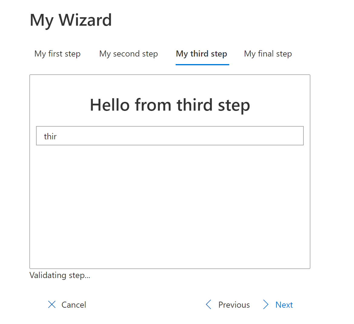
<WizardStep caption="My third step" step={MyWizardSteps.ThirdStep}>
<div className={styles.wizardStep}>
<h1>Hello from third step</h1>
<TextField
value={this.state.thirdStepInput}
placeholder="Type 'third' to validate the step (async validation)"
onChanged={(v) => this.setState({ thirdStepInput: v })}></TextField>
</div>
</WizardStep>
<WizardStep caption="My final step" step={MyWizardSteps.LastStep}>
<div className={styles.wizardStep}>
<h1>Hello from final step</h1>
</div>
</WizardStep>
</MyWizard>;
}
You'll probably have noticed the onValidateStep callback property that can either return the validation result directly or a promise resolving the validation result, it will allow to handle async calls during validation.
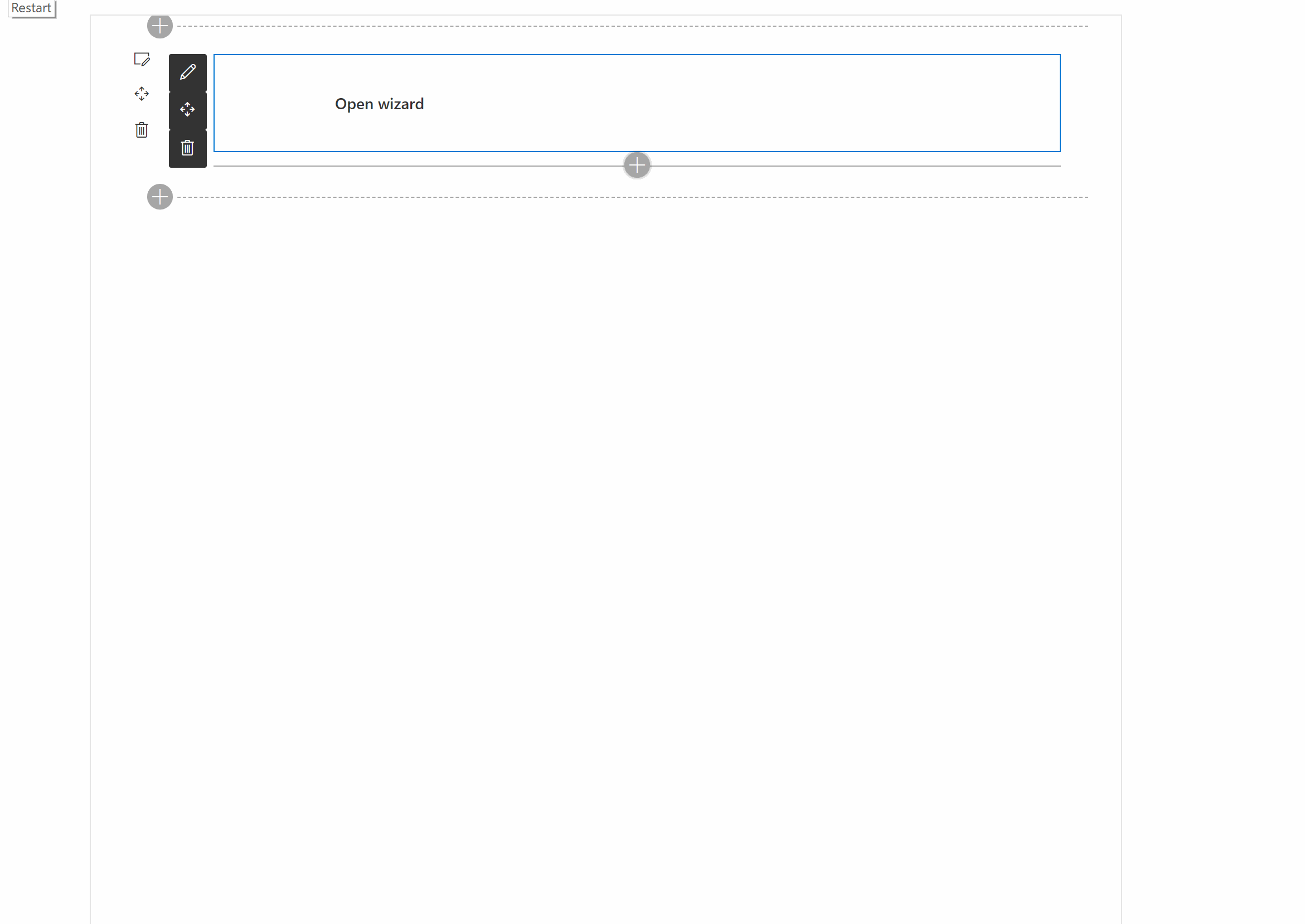
See the below animation to have an idea of what that component will allow you to do.
Hopefully, you'll find this little reusable component useful! You can find the whole solution on the Github repo here.
At the moment, it is not shipped it as a ready to use component, but feel free to do so :) Also, if you have any idea of improvement or notice some issue, please, notify me on the Github repo !
Cheers !
Yannick